Classic Blue
The PANTONE Color Institute’s official choice of color for 2020 seeks to instill ‘calm, confidence, and connection’.
Blue, or to give it its full and official designation – PANTONE 19-4052 Classic Blue – has been chosen by the famed color institute as the color of the year for 2020. For more than 20 years PANTONE has annually tipped a color for the upcoming period – the selection both a result of trend analysis, and a factor in trend-setting for fashion and design industries in the twelve months that follow.
Following 2019’s selection of Living Coral, and 2018’s Ultra Violet, this year’s choice might seem comparatively sedate. However, in its announcement the institute stressed the positive and pervasive effect that the color has upon us:
“Imprinted in our psyches as a restful color [it] brings a sense of peace and tranquility to the human spirit, offering refuge. Aiding concentration and bringing laser like clarity… Classic Blue re-centers our thoughts. A reflective blue tone, Classic Blue fosters resilience.”
This particular shade is calmer, and somewhat darker than the vivid – almost violent – blues associated with lapis lazuli and the earliest days of mankind’s blue pigment-making. It is thought by many today that the uniform idea of ‘blue’ as a hue came into being only alongside the development of blue dyes and pigments. The ancient Greeks had no word for blue specifically: neatly evidenced by the Homeric epithet οἶνοψ πόντος which is used repeatedly throughout the Odyssey to describe the ‘wine dark sea’. Indeed, it seems that tone and mood – not color – were principal in describing the skies and seas which we today commonly think of as blue.
"Imbued with a deep resonance, Classic Blue provides an anchoring foundation. A boundless blue evocative of the vast and infinite evening sky, Classic Blue encourages us to look beyond the obvious to expand our thinking..."
- Leatrice Eisman, executive director of the PANTONE Color Institute
In a statement published as part of the announcement Leatrice Eisman, executive director of the PANTONE Color Institute, expanded further upon the power of this particular blue, especially given what seems to be a period of political and social upheaval:
“We are living in a time that requires trust and faith. It is this kind of constancy and confidence that is expressed by PANTONE 19-4052 Classic Blue, a solid and dependable blue hue we can always rely on. Imbued with a deep resonance, Classic Blue provides an anchoring foundation. A boundless blue evocative of the vast and infinite evening sky, Classic Blue encourages us to look beyond the obvious to expand our thinking: challenging us to think more deeply, increase our perspective and open the flow of communication.”
In an article titled “The Business of Being Pantone: Turning Color Into Money”, law, business and culture blog, The Fashion Law, emphasised the significance of the announcement, particularly within the fashion business. “The impact of annual selection stands to reach from the colors of the garments and accessories that appear on runways in New York, London, Milan, Paris, and beyond during any given season to the hues that florists bank on for arrangements.”
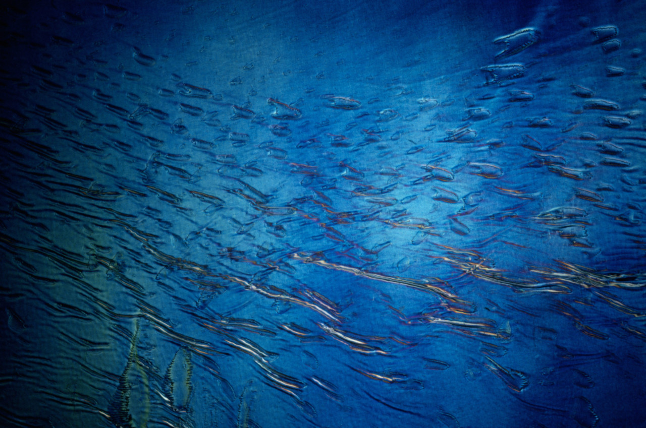
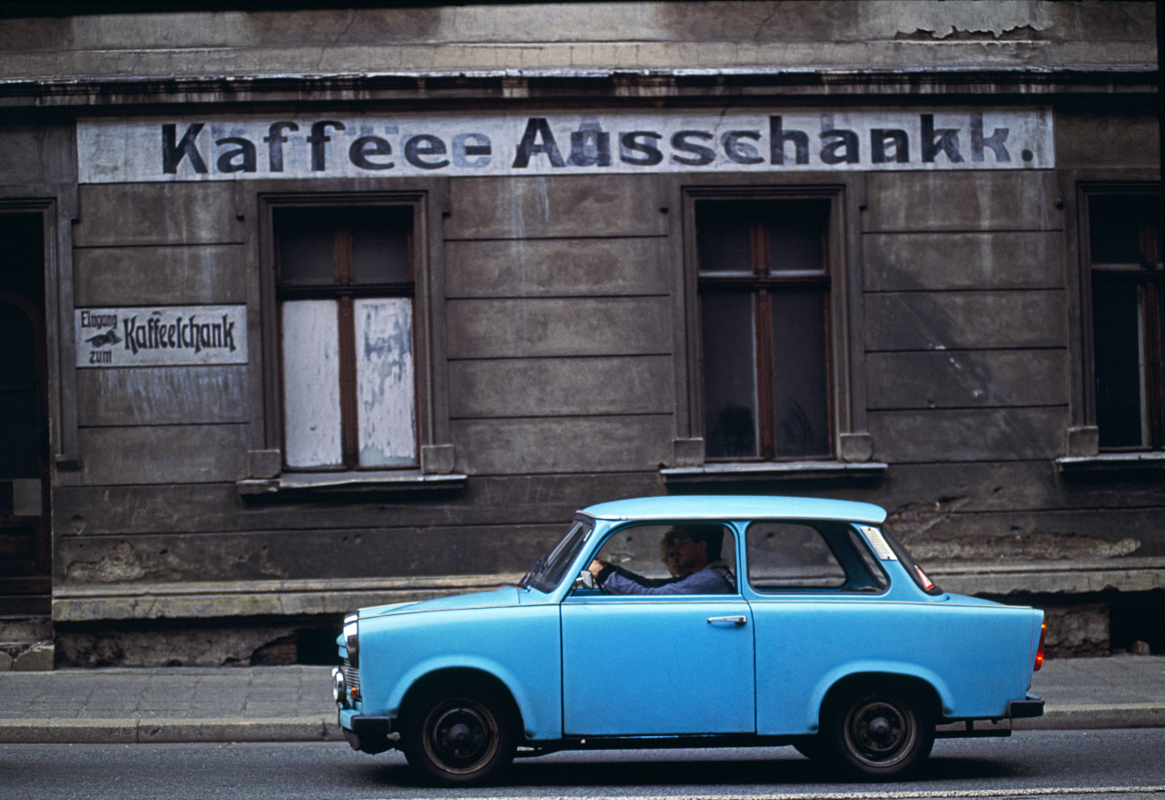
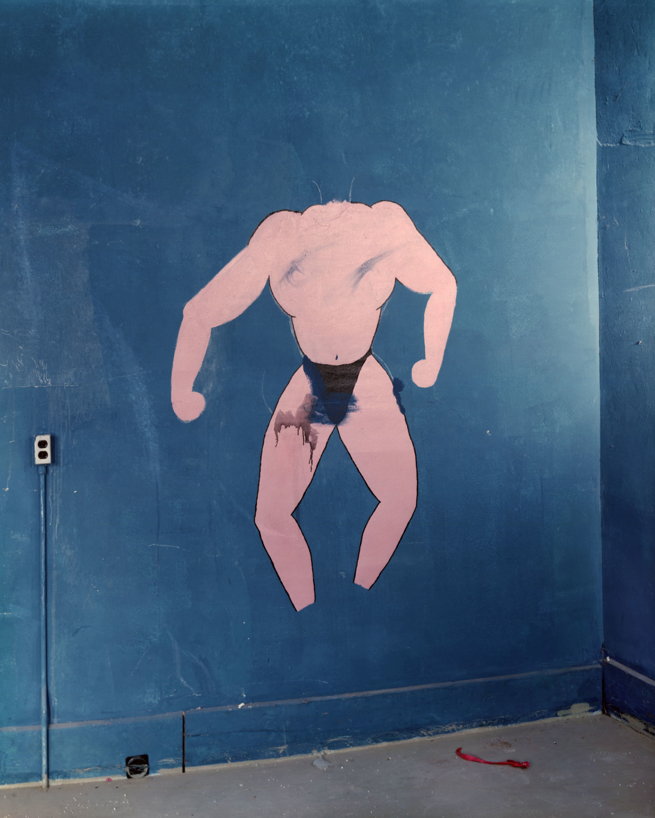
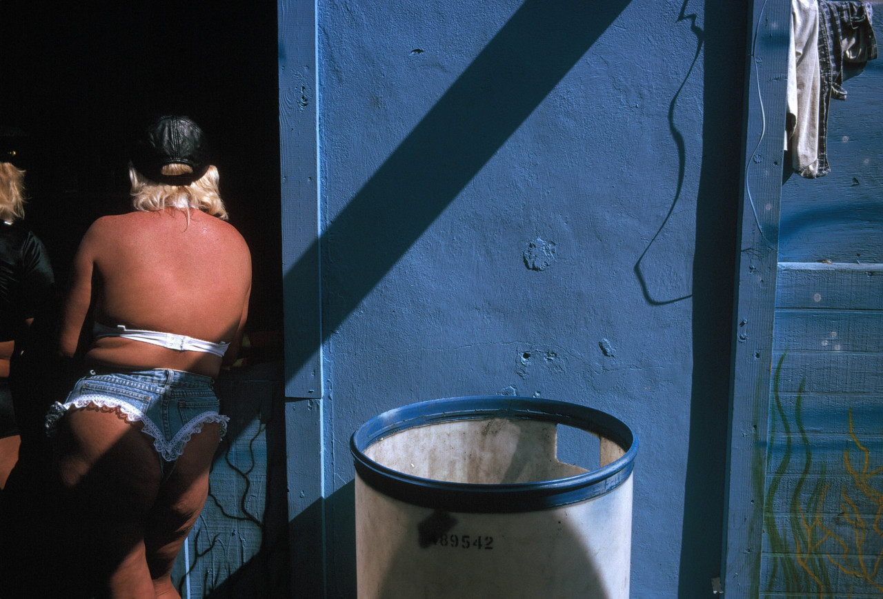
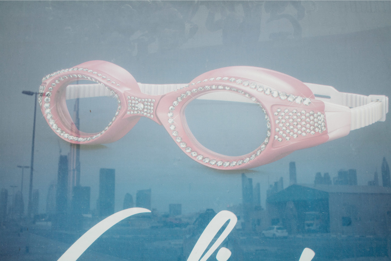
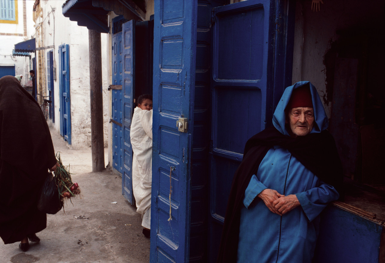
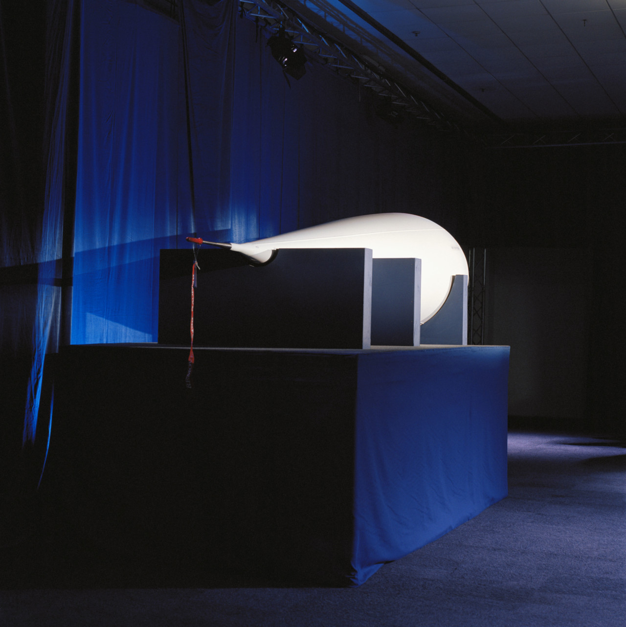
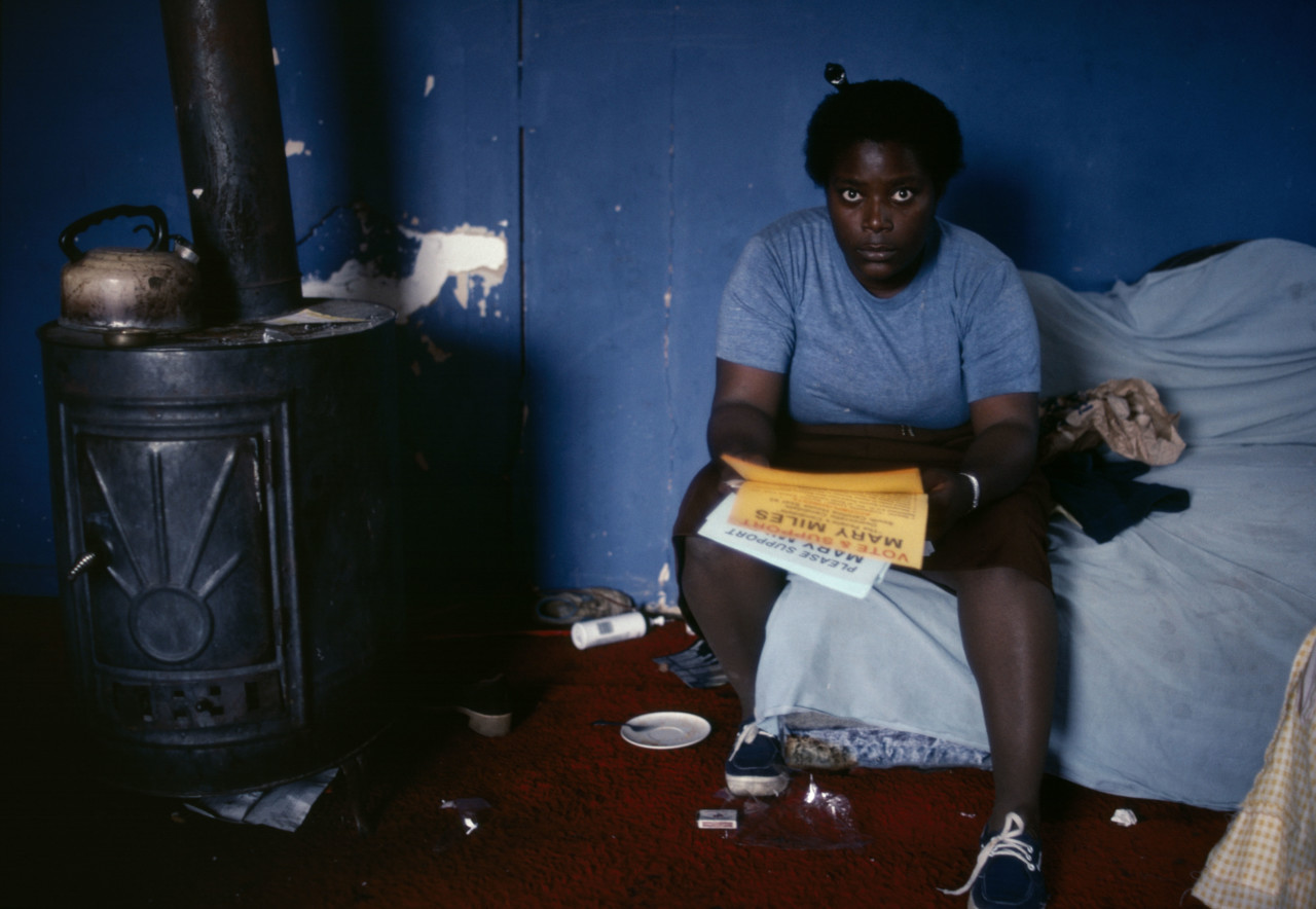
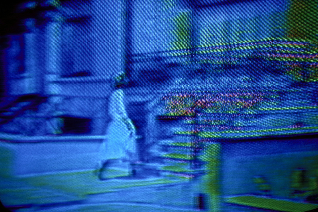
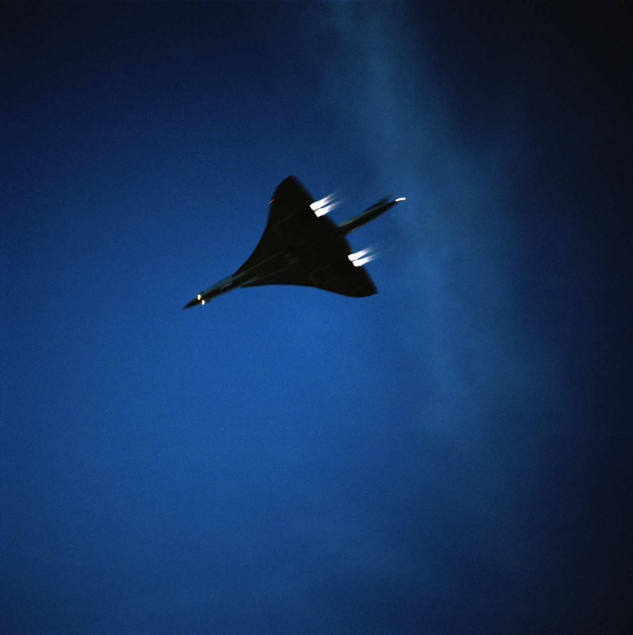
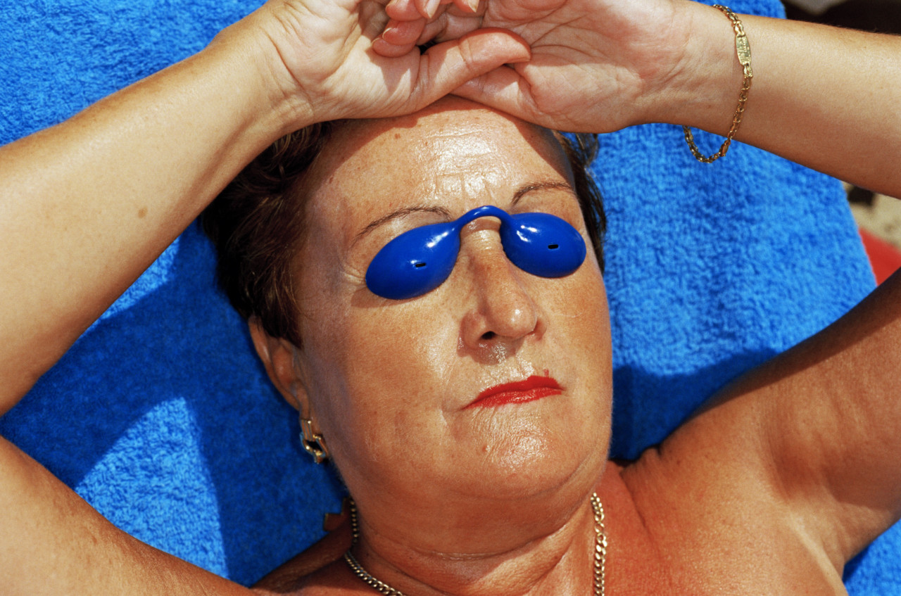
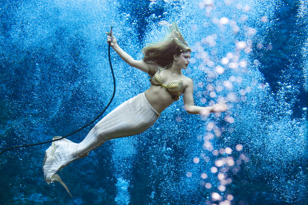
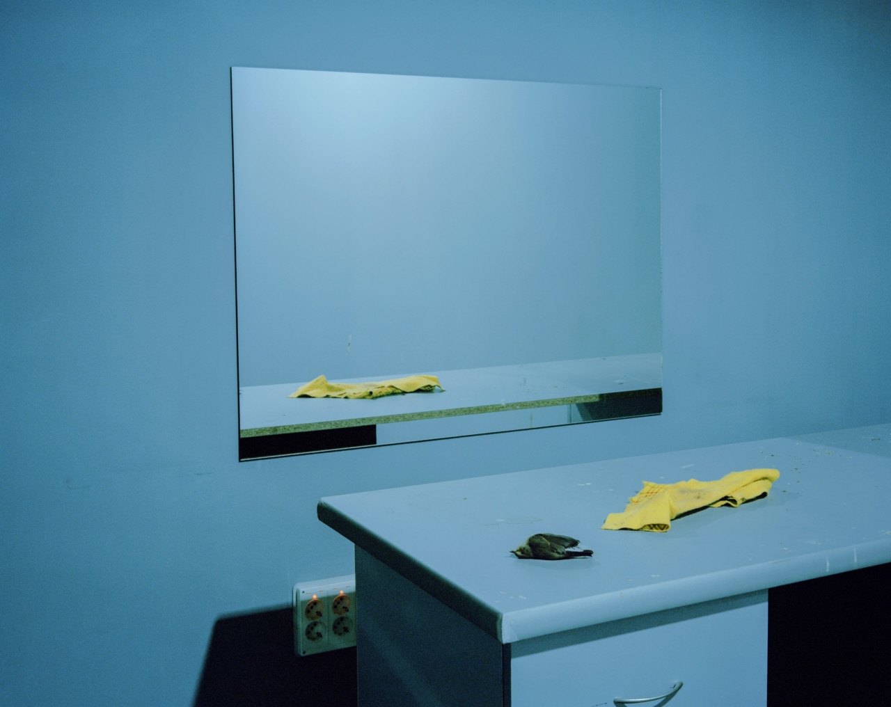
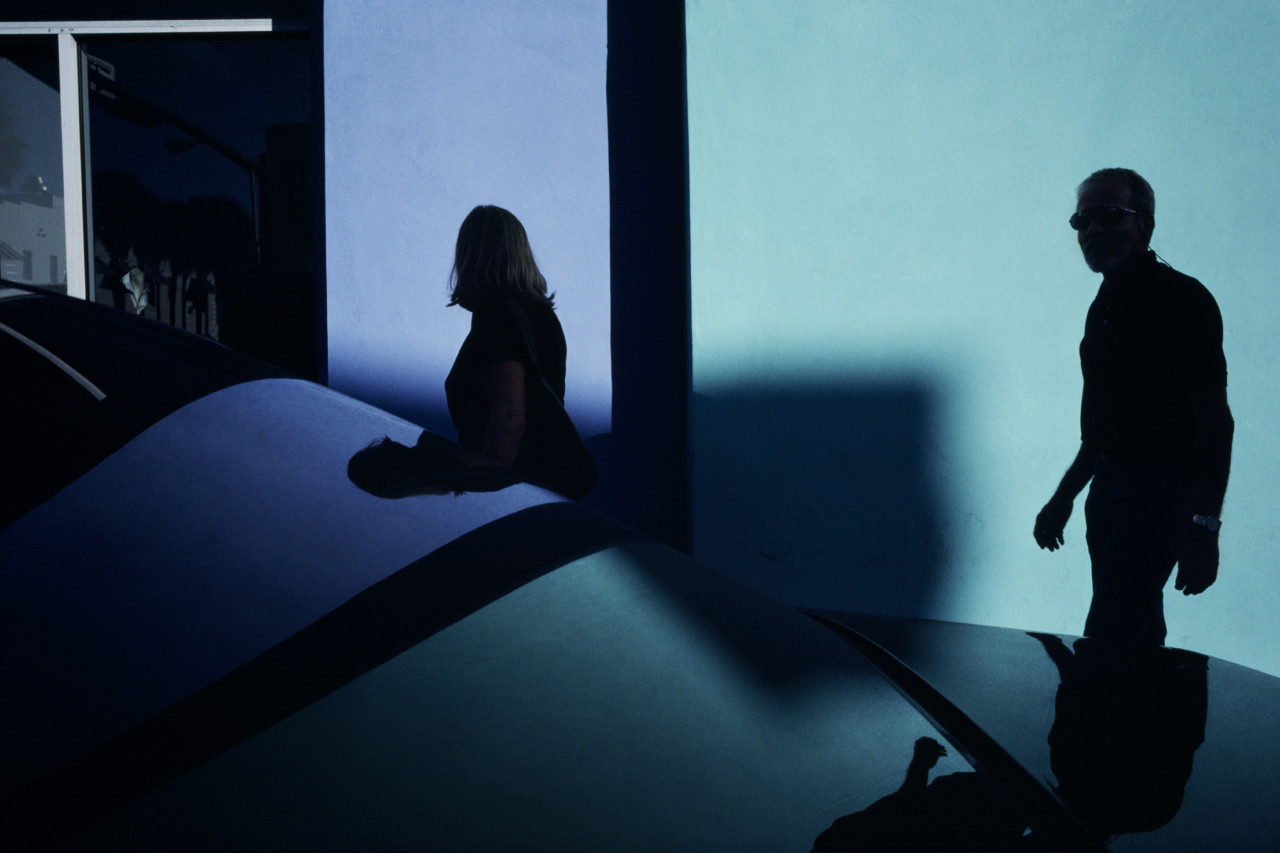
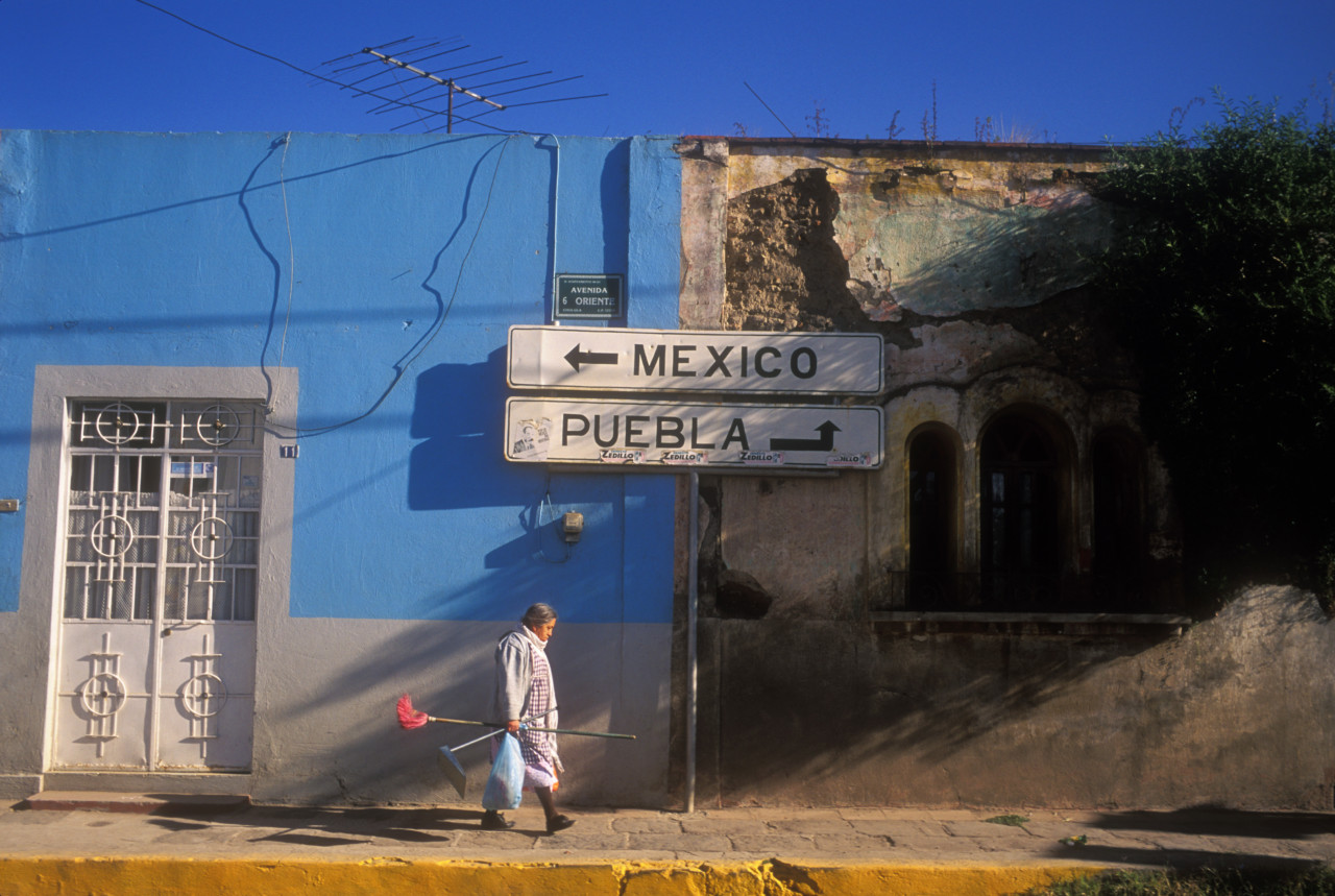
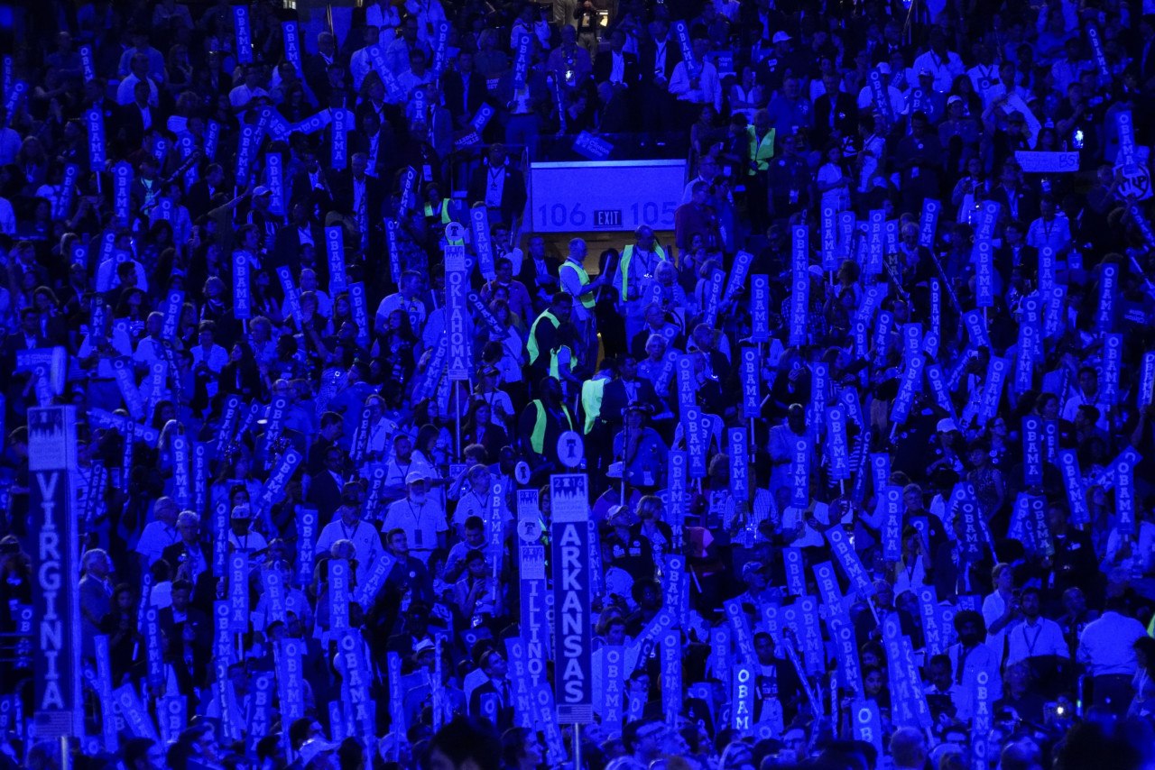
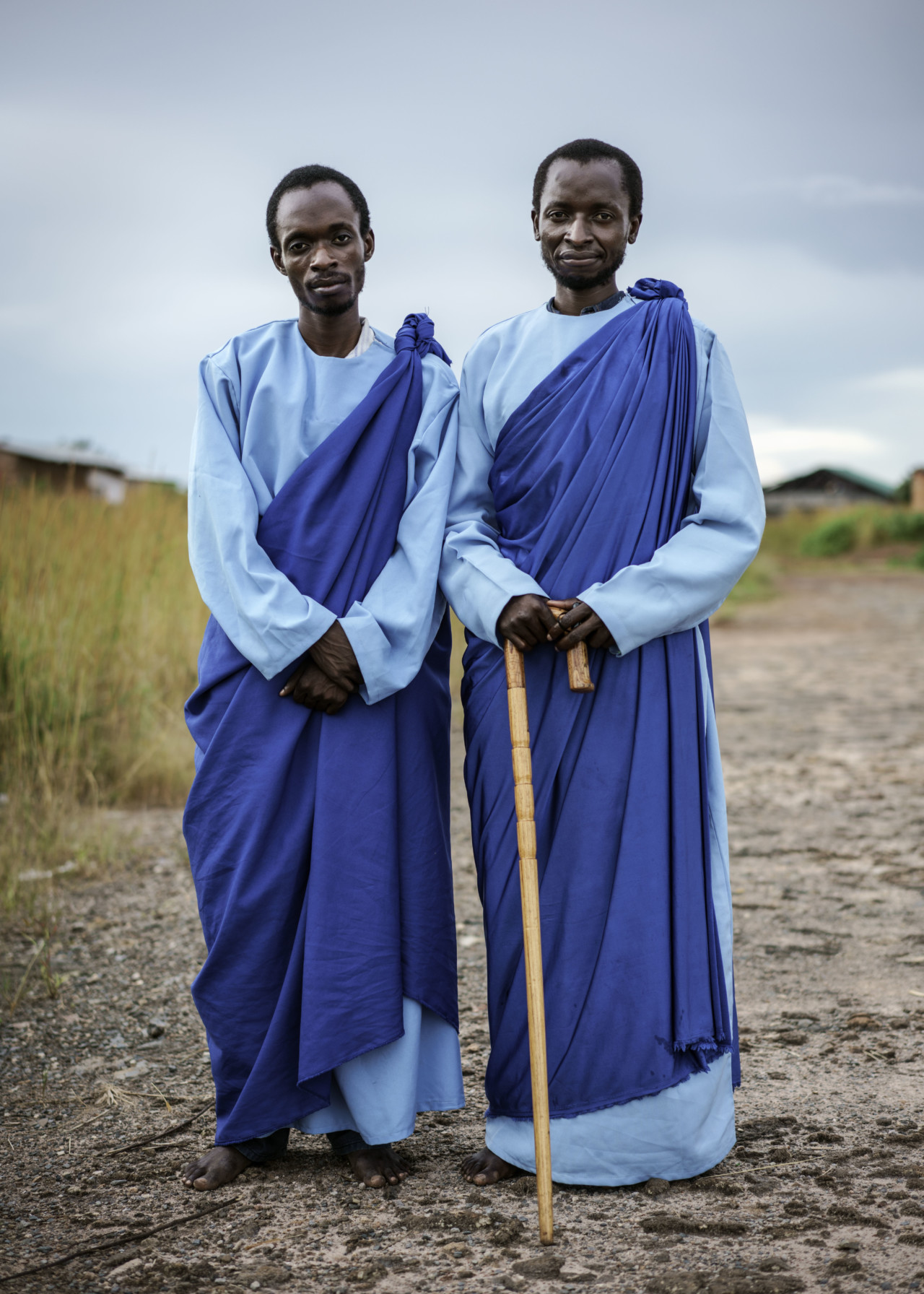
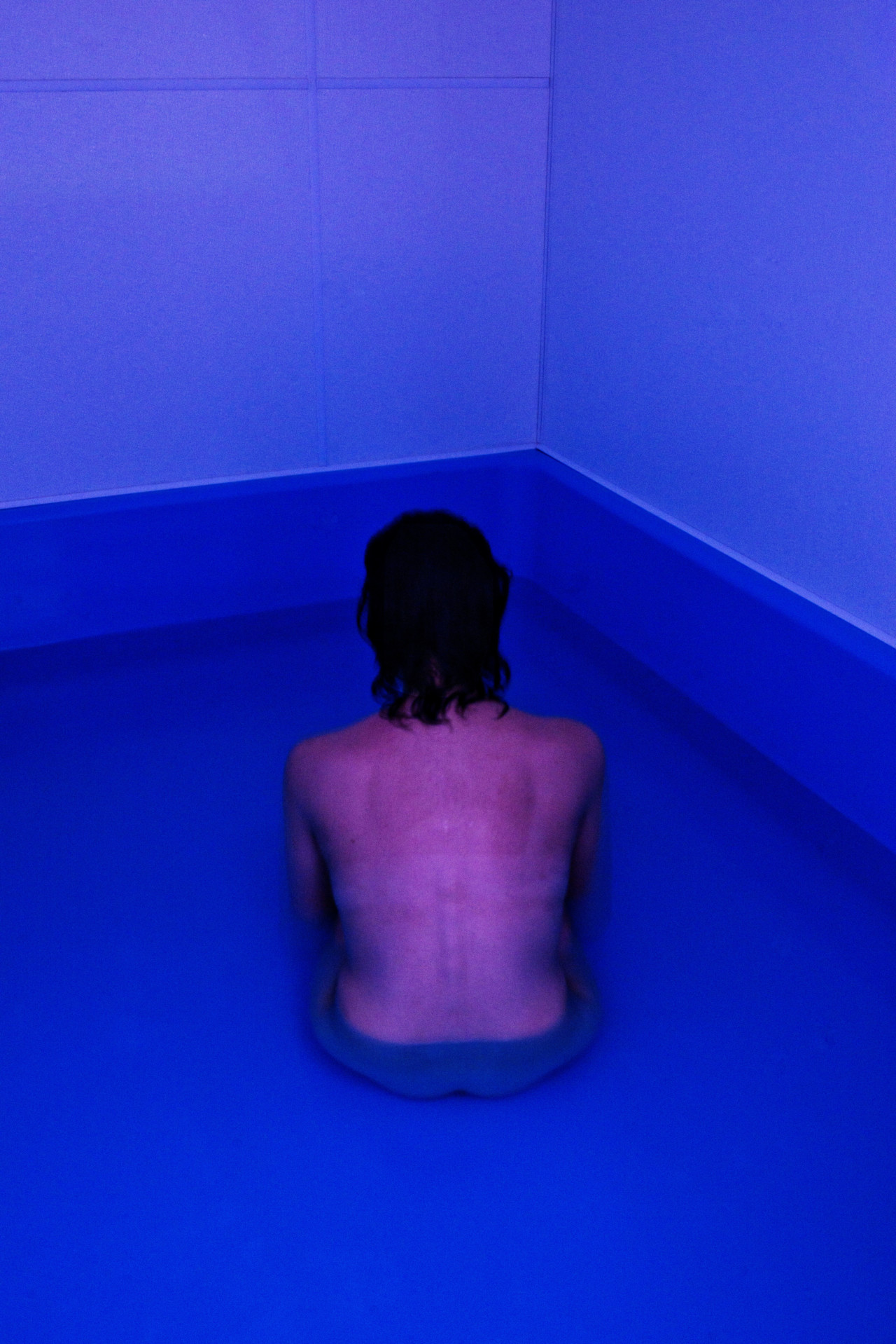
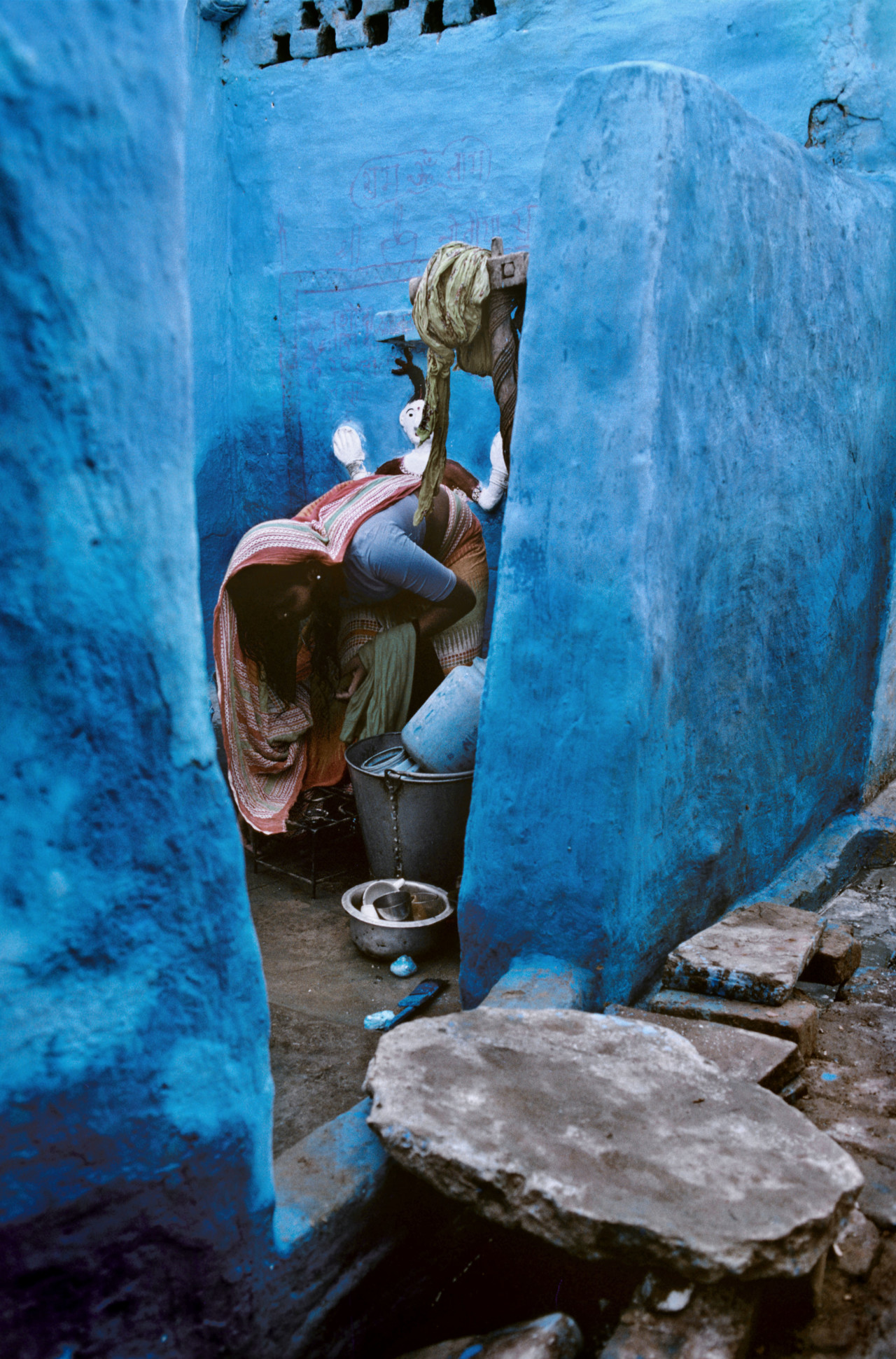
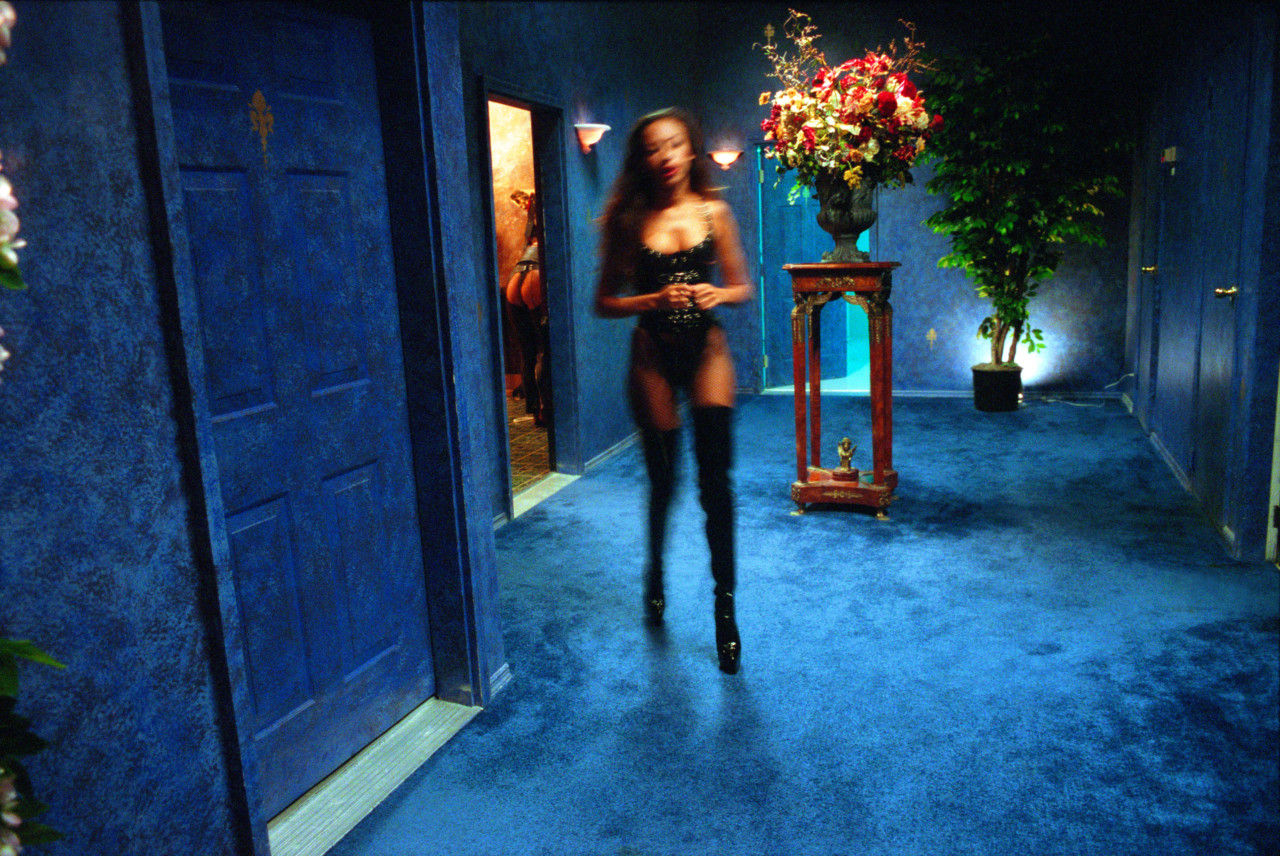
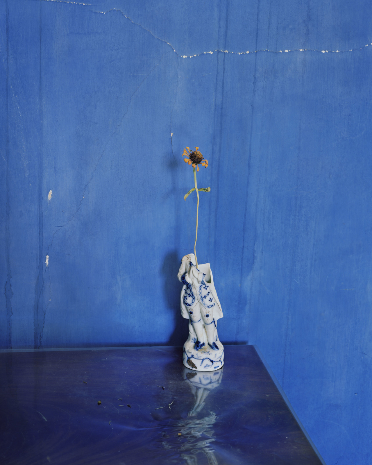
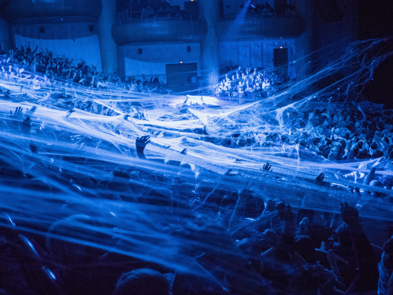
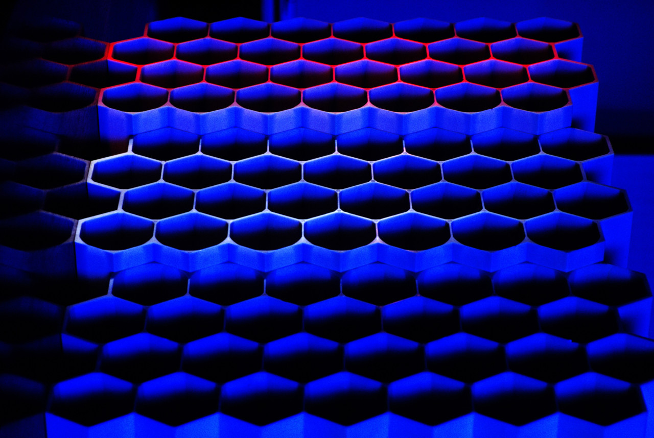
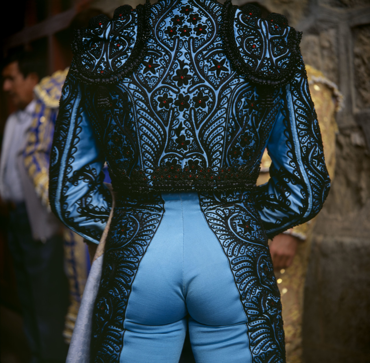
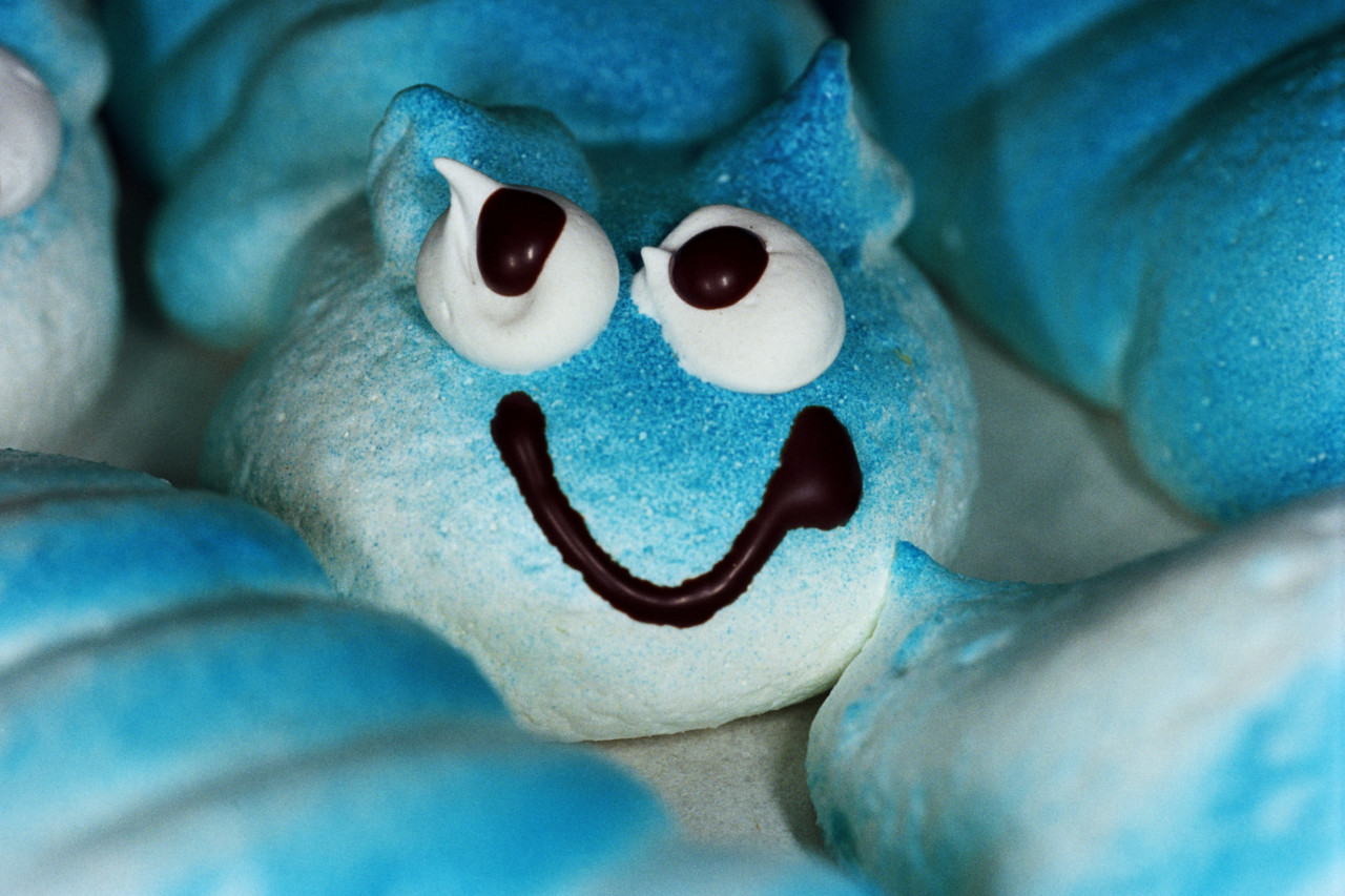
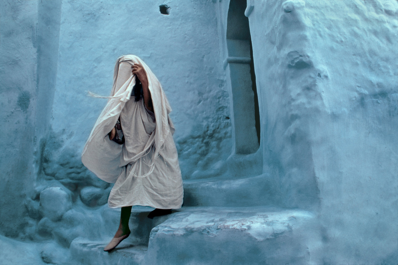
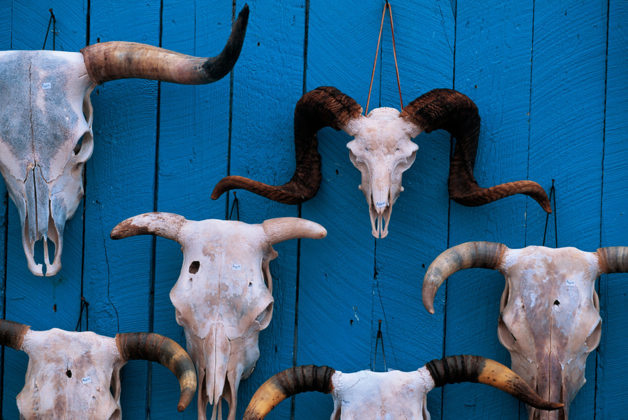
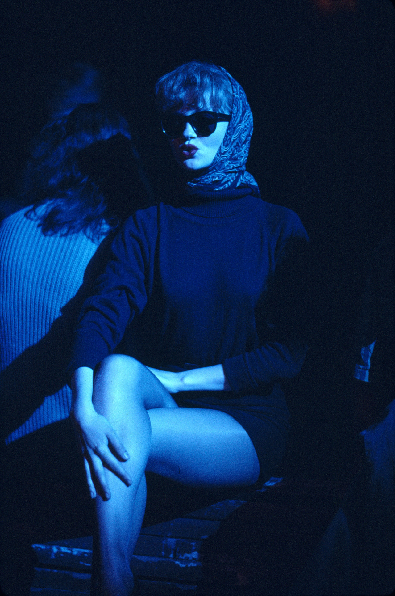
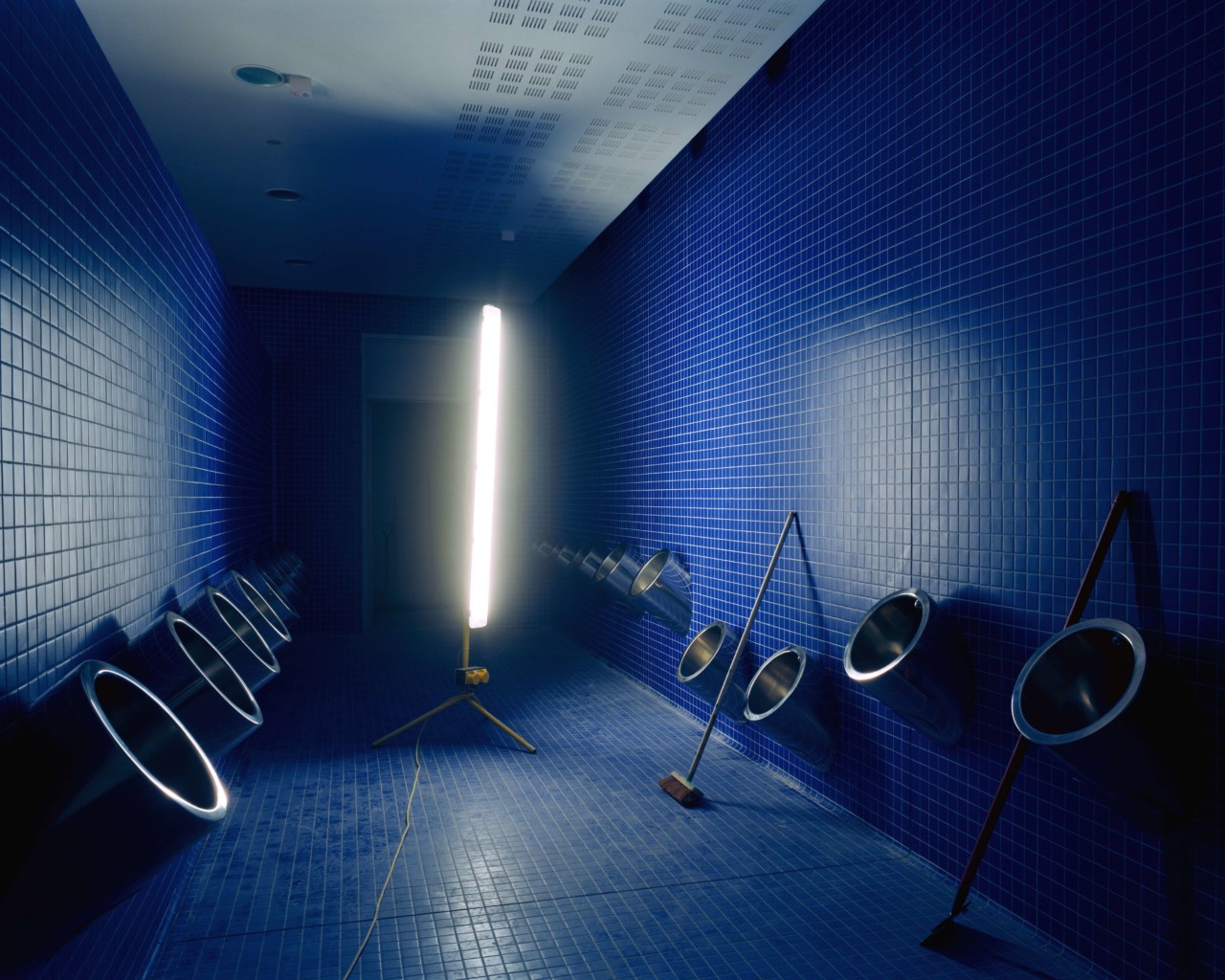
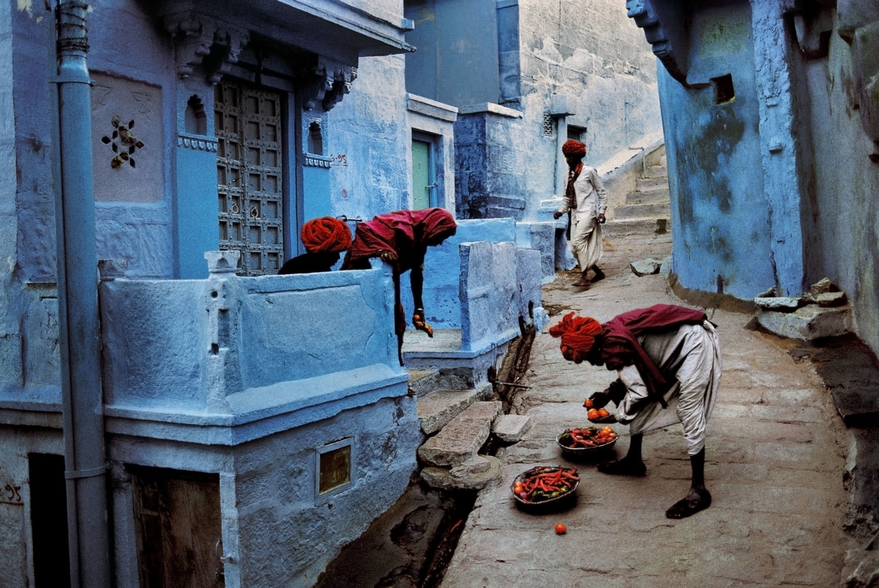
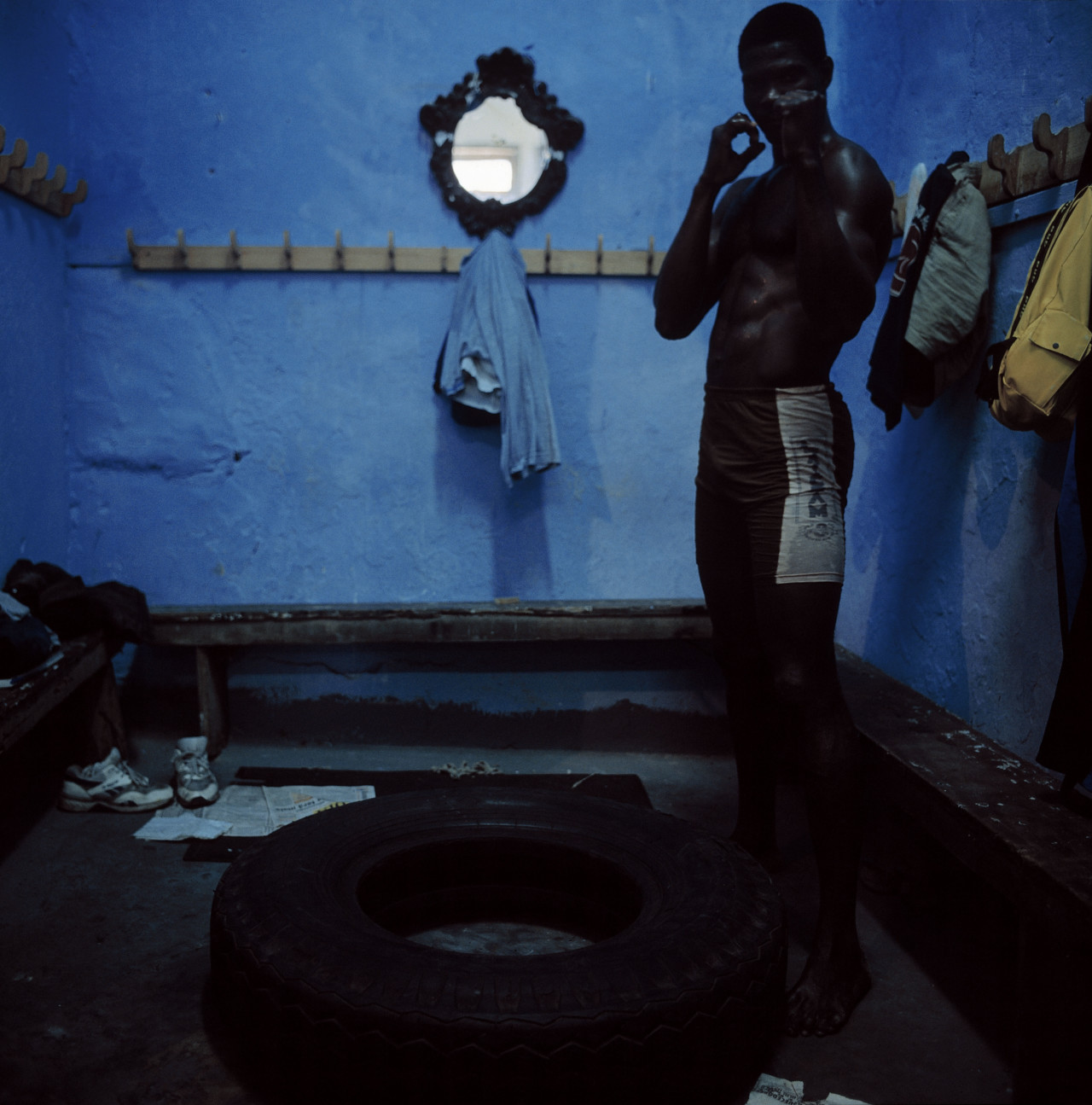
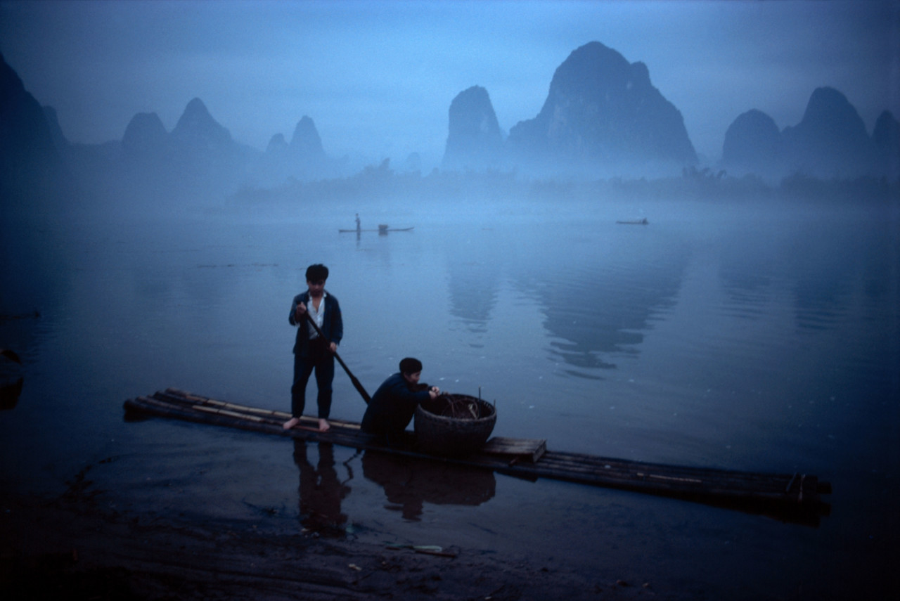
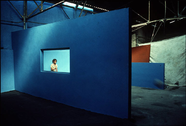
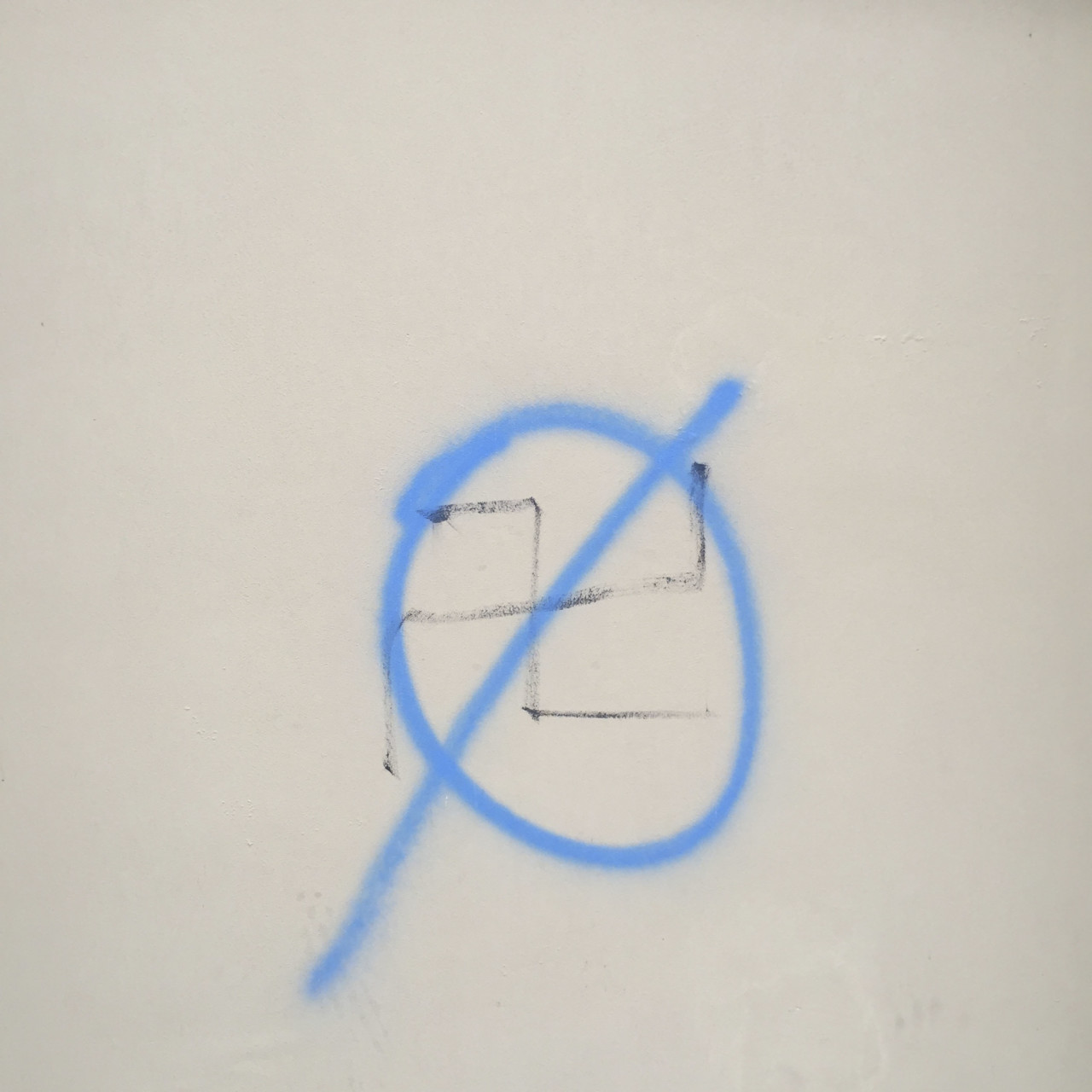
Above is a selection of only a tiny fraction of the images in the Magnum archive which capture variations upon the PANTONE color. They cover diverse settings, capture myriad moods, and range from luminescent to muted, serene to exuberant – yet all convey some degree of the sense of clarity that blue can transmit to the viewer.


