Concorde
Aviation journalist Joe Coles reflects upon the supersonic airliner's iconic design, and its place in visual culture and the popular imagination
The following article was written to mark the 50th anniversary of Concorde’s first flight, on 2 March, 1969.
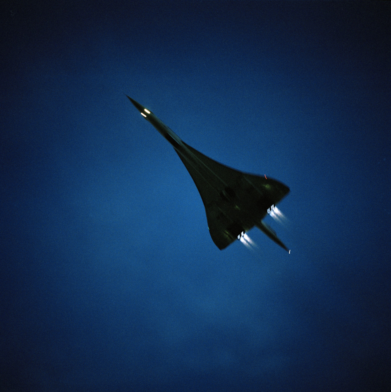
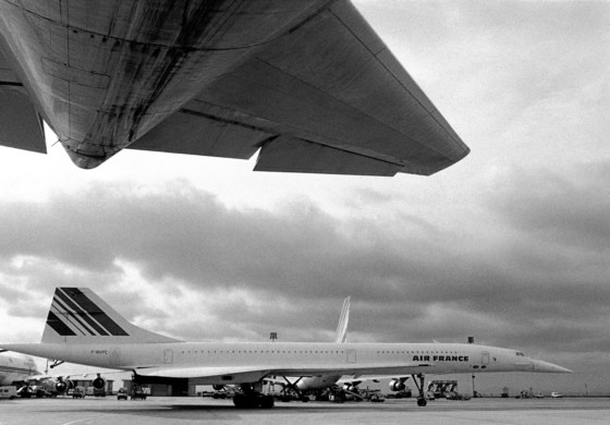
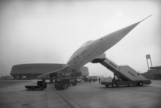
The future began 50 years ago today. On 2 March, 1969, onlookers at France’s Toulouse Airport gazed skyward as a new shape thundered into the air. Concorde, the most beautiful manmade object ever created, was utterly different from any other airliner in service – these were conservative ‘cigars with wings’, while Concorde was a swan-like dart of seductive curves, its form screaming urgency and modernity.
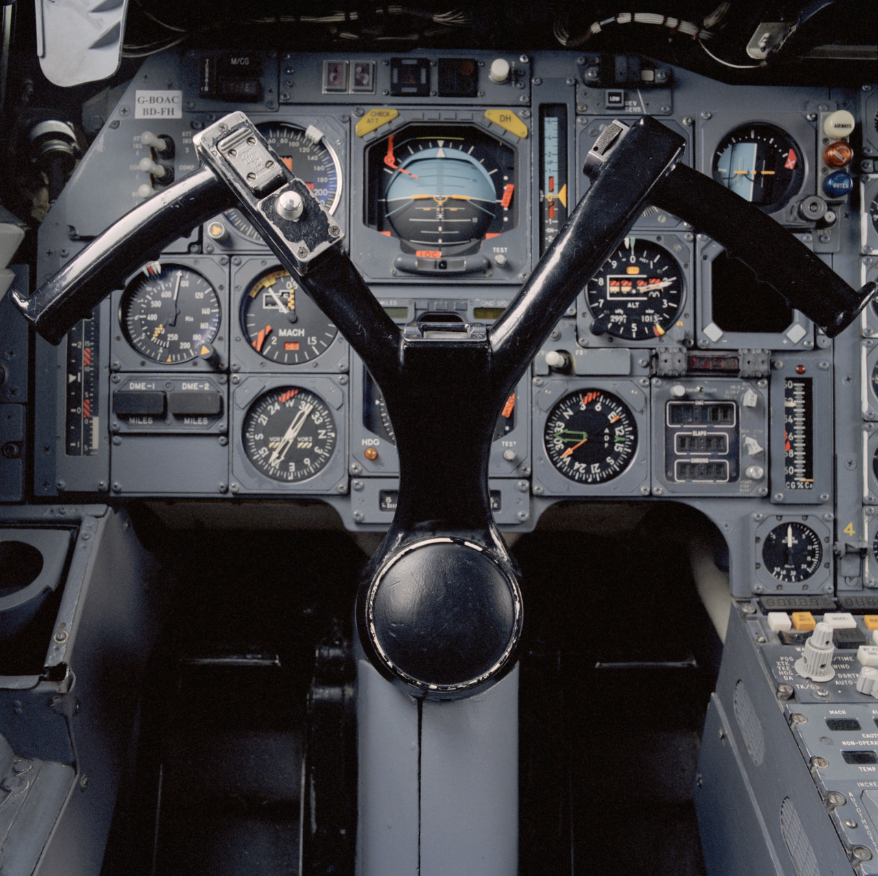
It was extremely fast; the previous generation of airliners had traveled below the speed of sound — Concorde could go more than twice that. At 1,340 mph it would travel 22 miles a minute. The speed of sound is measured as a ‘mach’ figure, and Concorde could exceed mach 2. The only operational aircraft of the time that could do this were military, and apart from specialized spy-planes, they could only travel at such a fuel-thirsty pace for a matter of minutes.
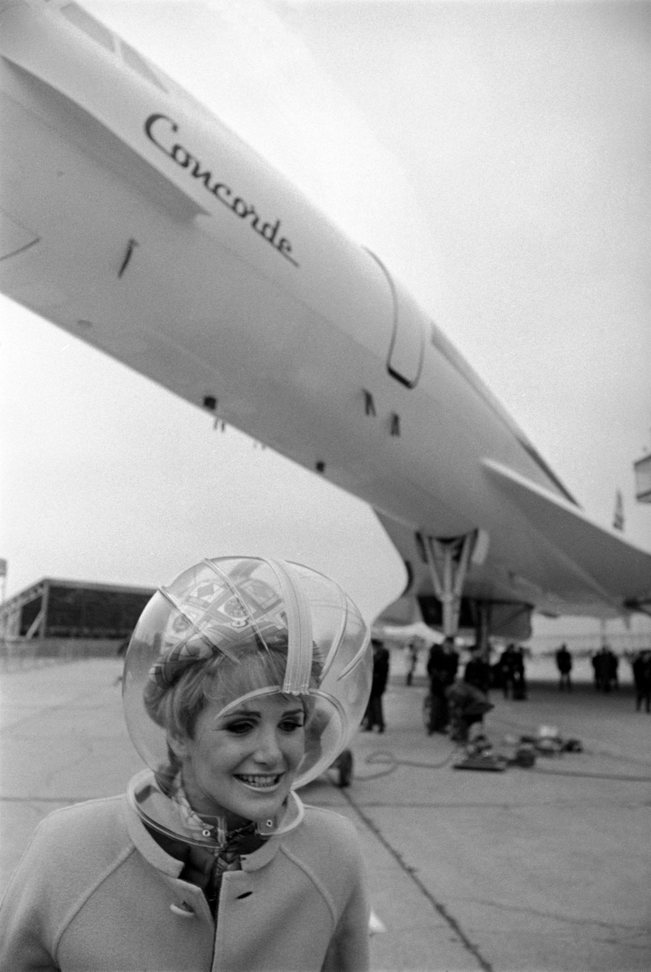
What had been the exclusive realm of fighter pilots in g-suits, was now shared with Chanel-wearing actors sipping champagne. Not only did they travel supersonically in great comfort, they did it for hours. Journey times were snipped in two. Traveling from Heathrow to New York’s Kennedy airport, this miraculous machine would arrive 90 minutes before it had taken off, local time. Concorde would make the extraordinary every-day.
"With Concorde, the form absolutely followed function, and this resulted in an exceptionally beautiful design"
- Joe Coles
Speed alone would not have made Concorde as loved as it became, as was mentioned, it was also extremely beautiful. The 1960s was an era of television, cinema and photography, and it is via the latter that Concorde seduced the world. Throughout its life it was beloved by photographers, artists and the public alike, but were its good looks accidental? When I asked the supercar designer Peter Stevens why streamlined designs are often gorgeous, he noted that to some extent we ‘see’ with our hands. When we look at an object we imagine running our hands across it, “You can push the airflow around but you cannot force it to do what it does not want to do. I see the air as being lazy and wanting to take the least stressful path, and it is the same for your hand when passing over a form. Natural transitions, as seen in nature, almost always have something to tell us about the best aerodynamic shapes.”
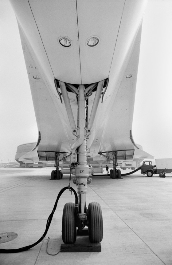
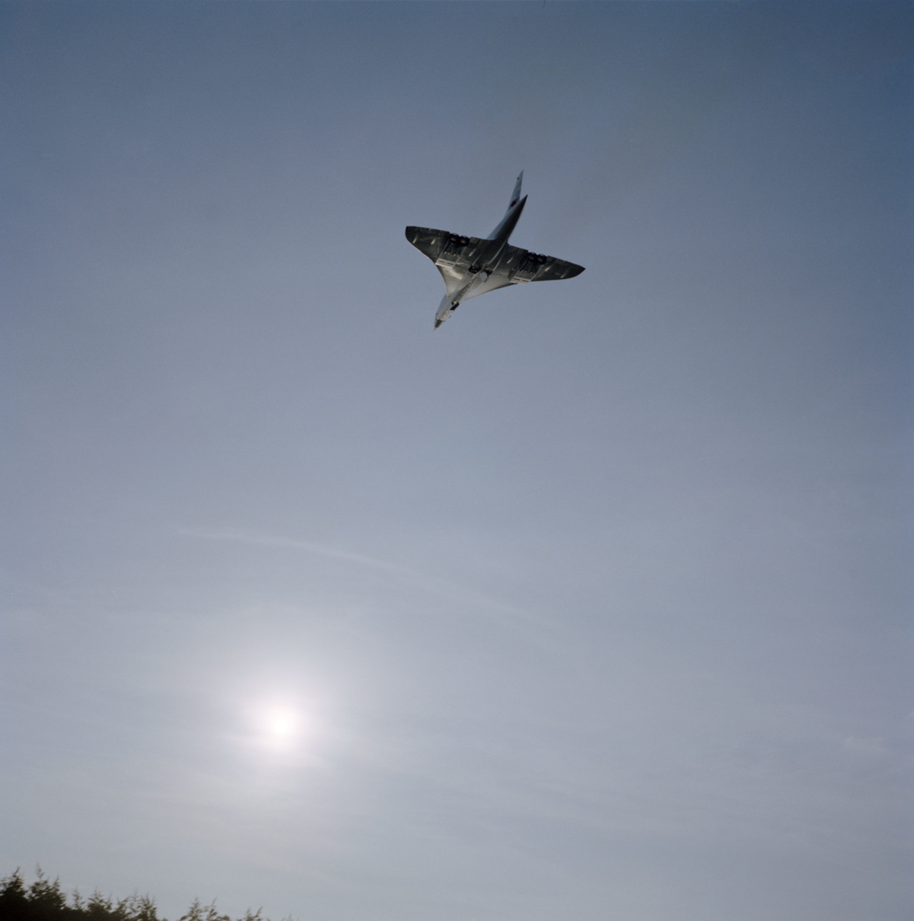
With Concorde, the form absolutely followed function, and this resulted in an exceptionally beautiful design. Though cars can sacrifice aerodynamic efficiency for beauty, an aircraft cannot – and this pleasing shape was indeed a desirable byproduct. The wing needed to be sharply swept back for efficient flight at mach 2, but a simple triangular shape (known as a delta for its similarity to the shape of the Greek letter) would have resulted in an exceptionally long take-off distance and unpleasant handling characteristics. An ‘ogival delta’ proved the solution. Appropriately for this cathedral to speed, the ogee is a s-curved shape common in English gothic architecture.
"Much of the marketing was based on this clean, futuristic image, a probing, heroic machine in empty skies"
- Joe Coles
A new Europe
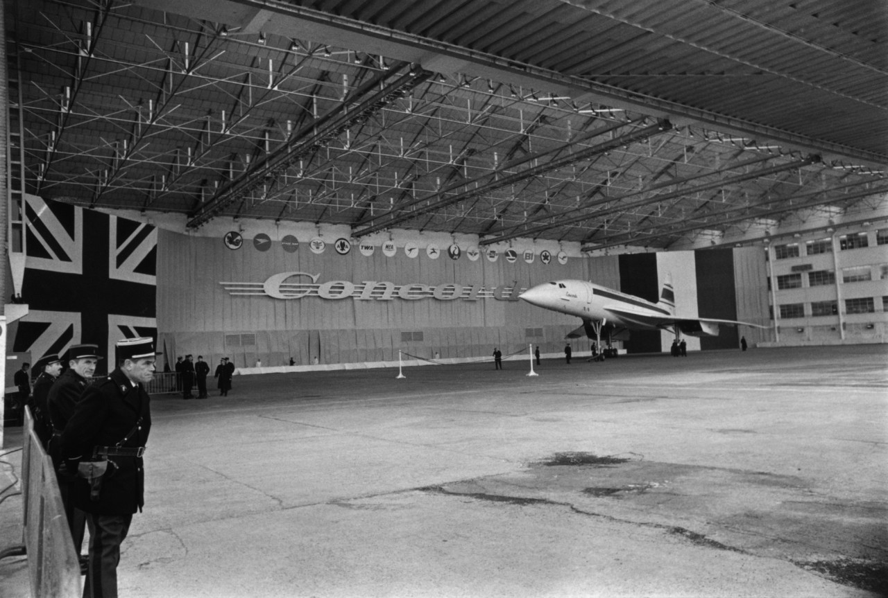
In the 1960s Europe was uniting, partly as a counter to the economic supremacy of the USA, and the Concorde was the child of a very special friendship between Britain and France. As well as a hope for a more united Europe, Concorde also spoke of a global utopian desire. With the moon landings a few months away, 1969 carried a strong sense of optimism. Boundaries were being broken both technologically and socially, and anything was possible. Concorde was almost a spaceship, and one that anyone rich enough could fly on. Earlier advertising for airliners had compared them to ocean liners, but this was a rocket-ship.
Much of the marketing was based on this clean, futuristic image, a probing, heroic machine in empty skies. Far from the egalitarian vision of cheap, mass air travel delivered by the Boeing range, the Concorde experience was elitist and extremely expensive. Considering the huge operating costs, it had to be. Champagne, lobster, caviar and foie gras delivered by immaculately dressed stewards made Concorde the fastest, high-class restaurant in the world.
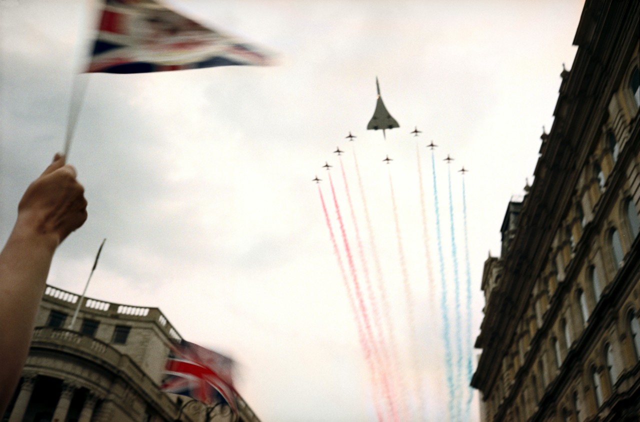
The creation of advanced airplanes is a very conspicuous way to wave the flag. Though its cultural exports were booming in the 1960s (notably in music and fashion), Britain’s earlier position as leader in the automotive and aeronautical industries was on the wane. France’s, meanwhile, was on the rise. Civil aviation is historically dependent on military research, and as Britain’s military aircraft manufacturing shrunk, its civil industry followed suit. Britain had produced the first jetliner, the beautiful Comet, in 1947, but now America had almost complete market dominance. Since the mid-1940s the US had usurped Britain and Germany as the most technologically advanced nation. The Anglo-French Concorde was a bold counter-attack from Europe. Concorde was twice as fast as any other operational airliner in 1969, and this remains true today. Though the Soviet equivalent, the Tupolev Tu-144 (nicknamed the ‘Concordski’), had beaten the Concorde into the air by a matter of weeks, this inferior rival would ultimately fail, leaving the Concorde as the only successful supersonic jetliner. Its US rival, the Boeing 2707, though bigger and faster, proved so expensive and technically daunting it was canceled before it flew.
"Concorde’s roots lay in the 1950s, and in many ways it represented the ultimate ‘50s vision of the future"
- Joe Coles
With the nascent 747, the US was now betting the farm on size and efficiency, while Europe was rooting for speed and luxury. Though it first flew in the 1960s and found fame in the 1970s, the Concorde’s roots lay in the 1950s, and in many ways it represented the ultimate ‘50s vision of the future. Until 1969, progress had a close relationship with speed: technology gave us faster trains, cars, ships and airplanes. With Concorde, and military aircraft generally, speed came up against practicality — was it necessary to go any faster? Market forces said ‘no’. In 1969, the F-4 fighter had a top speed of Mach 2.2. Today, the US’ most advanced fighter, F-35, can reach Mach 1.6. Simply put, airplanes stopped getting faster in 1969.
Concorde’s shape sold itself, as often mentioned the power of Concorde is largely in the mind, and equally emotive to onlookers as to passengers. The wing is the most visible symbol of flight, had Concorde’s been a simple straight-edged triangle it would have communicated speed and aggression. However, the addition of those afore-mentioned curves on Concorde’s wing added a unique sensuality; the future was fast, but it was also elegant. Design was once satirically described as the art of adding curves, by this measure Concorde was a masterpiece. This sophistication was clearly a marketing coup, with many on both sides of the Atlantic entertaining the idea of Europe as being more ‘sophisticated’ than America, a nation that some saw as a brash new upstart.
Air France’s branding led the way with an appropriately modern appearance for both the exterior and interior of the aircraft. British Airways was a little slower, but the company’s radical 1984 revamp transformed the Concorde brand. The new look moved away from staid, patriotic Britishness to a fresher, and swifter, present. Gone was the old-fashioned typeface that had declared ‘British’ across the forward fuselage in a seriffed, curved and rather imperial style, to be replaced with a bold but smaller all-caps ‘British Airways’. The famous, blue ‘Speedbird’ motif that ran the length of the fuselage was superseded by a more dynamic, red ‘Speedwing’. Whereas the older look was one of national confidence and a pride in the past, the new image whispered high velocity, style and refined luxury.
In 1997, British Airways enjoyed another – arguably less popular – rebranding. The geometrically tidy national colors on the tail become a wavy, irregular ‘fluttering banner’. The Speedwing was replaced with a smaller ribbon known as the ‘Speedmarque’. This lighter look, though less authoritarian, was Concorde’s blandest scheme. Yet despite this, Concorde never grew boring, and it was a sad occasion when it was retired in 2003, a mere 27 years after the aircraft was introduced to commercial service. It died a champion and in its absence the world slowed down.
Key to Concorde’s iconic mystique was its failure. Though technologically it was a resounding success, it was a commercial disappointment: a mere twenty were built, which is a tiny amount when compared to its contemporary, the larger Boeing 747, of which over 1,500 have been produced (and continue to be produced in 2019). Though at times Concorde was profitable, it was expensive to operate and maintain — and this become starkly apparent in its final years. This meant its unusual shape was always special, always identifiable. Familiarity breeds contempt, but Concorde remained gloriously special to the end.
Joe Coles is editor of alternative aviation magazine, Hush-Kit


