The Paolo Pellegrin Project: Making the Photographer’s Latest Book
Yolanda Cuomo, the award-winning designer of Pellegrin's massive retrospective publication, reflects on the process of making a book that was not so much by Paolo, as about him
Award winning designer, art director and educator Yolanda Cuomo has since 2011 worked on four book projects with Magnum photographer Paolo Pellegrin. The latest was the eponymous 700-page retrospective monograph which accompanied the photographer’s landmark show– Un’Antologia – at Rome’s MAXXI gallery. Cuomo was art director of Aperture Magazine from 1992 to 2002 – work for which in 2004 she received an ASME (American Society of Magazine Editors) award. Cuomo teaches design at New York University, Department of Photography & Imaging, Tisch School of the Arts and has designed books for scores of photographers including Magnum’s Gilles Peress, Steve McCurry and Peter van Agtmael – as well as the Magnum group project New York Spetember 11. Cuomo also designed the 2011 Diane Arbus retrospective which toured internationally.
Here, the designer explains how she and her team, alongside the Italian art historian and curator Germano Celant – provider of the book’s texts who sadly died in April of this year – created a book that was more a reflection of Pellegrin himself than a catalogue of his works.
I first met Paolo Pellegrin in 2000. I was introduced to him by Melissa Harris. She was the editor of Aperture Magazine and I was the art director. We published his portfolio about Kosovo in Issue 165. There was immediate positive chemistry between all three of us. That began a collaboration for us all that was to last more than 20 years. Over those years, Paolo asked me to design three books for him: Dies Irae published by Contrasto 2011, Paolo Pellegrin published by Magnum 2012 and Congo, Maioli / Pellegin published by Aperture in 2015.
When Paolo asked me to design the book for his MAXXI retrospective, it was a massive undertaking and a different kind of book. The editor and catalyst for the book and exhibition was Germano Celant, the great thinker and Italian curator. Germano came to New York to meet me. We had many meetings always on quiet Saturday afternoons at my studio. I will never forget his poetic directness. He always thought with a pencil in hand and would make me sketches of his ideas. We first discussed the design of the exhibition at the MAXXI, the Roman Museum designed by Zaha Hadid. Germano described the exhibition space at the MAXXI as a difficult one. The floor was not perpendicular to the walls but rose on an incline as you entered, and the walls were slightly tilted. He thought we should approach the exhibit as if one were walking upstream.
He made me a drawing of a river.
We worked on an early prototype for the installation, getting familiar with the material that would be both in the exhibit and book. The space proved too complicated for us to realize from abroad. We needed an architect’s mind. The realization of the exhibit was designed by Sergio Bianchi, the Roman architect. He along with Paolo, Annalisa D’Angelo and Chiara Pellegrin developed, designed and installed the exhibit at the MAXXI.
We were then free to concentrate on the massive tome of Paolo’s life.
Germano visited a few weeks later to continue our conversation about the book.
He said to me, ‘This is not a book by Paolo, but a book about Paolo’. Germano sent me other books that he authored about Robert Mapplethorpe, Louise Nevelson, Frank Gehry, Ileana Sonnabend and the arte povera movement. His books were intricate tapestries weaving the artists’ work into the context of the world they lived in.
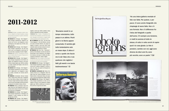
When we approached the chronology pages in Paolo’s book, we first used my design of Diane Arbus’ book Revelations as a starting point. We made design presentations to Germano, but he felt it was too academic. He wanted more weaving of current events and the history of photojournalism into the text of Paolo’s biography. We worked on many versions of the chronology pages until we finally arrived at the right mix of typography, news, clarity, journalism and beauty.
The chronology was just one part of the book. We worked with Raffaella Perna, who was the associate editor and writer of the book, and the Pellegrin team in Rome headed by Annalisa D’Angelo. Bonnie Briant, my design associate, skillfully crafted each page. She was assisted by Bobbie Richardson who meticulously check listed every typeface, hairline and detail to ensure there were no errors.
The second component of the book was the portfolios. Germano gave Paolo full control of these. The portfolios were interspersed between the chronology pages. These were pure visuals – the images in all their power, juxtaposed and paginated for impact and purity. We hired Diana Stoll, the writer, to interview Paolo to introduce each portfolio.
Paolo initially visited the studio for a week so we could have an intense design blitz session. We experimented with book formats, photo sizes, bleed or non-bleed: the basic structure of the book. We made hundreds of pages to get a feel of the book. We arrived at the page size of 8×10”, a good size to experience the images and also be reader-friendly. With printouts in hand of proposed design pages, Paolo took them back to his studio to share with his team in Rome. Paolo and Annalisa began editing the massive body of work for the book.
[Video by Bobbie Richardson]
Two months later, Annalisa arrived at my studio in Chelsea with a suitcase full of hard drives. She lived at my house for weeks. We would edit at night under the magnolia tree in the garden and on the weekends in the dining room. During the day Annalisa would bring the selects to the studio where we would skype Paolo. We would screen share with him and compose the portfolios together.
Paolo visited the studio several more times for intense extended working sessions.
Annalisa came another three times, always loaded down with hard drives and beautiful photo compositions she had made over the years. We experimented with covers and foldouts and then developed a third component, the magazine pages. This third component of the book showed photographs in the context of magazine pages. They were photographed and edited by Paolo’s team in Rome.
Finally when we had a prototype we thought was ready, Paolo met with Germano in Milan for his commentary and approval. With all the pieces in place, production began in two languages: Italian and English. We worked closely with the publisher, Silvana Editoriale, to prepare the files. Paolo went on press in ensure that the printing quality was as close to excellent as possible.
One thousand books were printed and numbered. It was a beautiful process. We lived and breathed the book the entire summer months. Annalisa, along with Paolo, made the magnificent collages in the book that were also used in the MAXXI exhibit.
It was our job at the studio to cobble everyone’s talents together, to make a book that was Paolo.
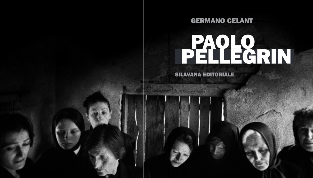
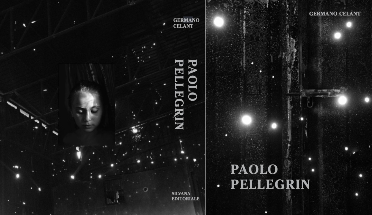
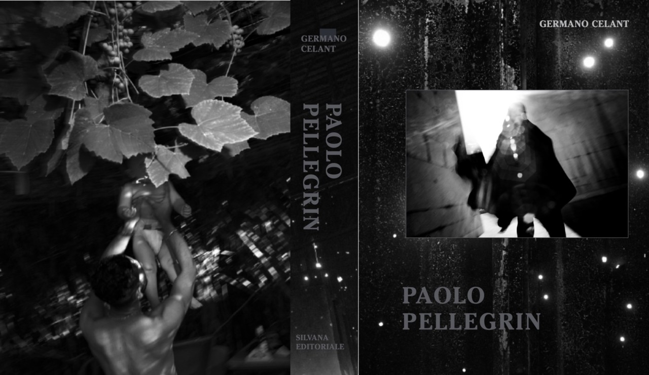
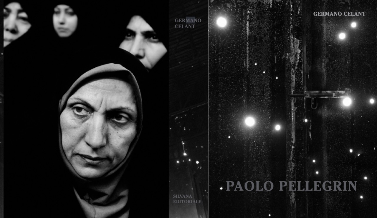
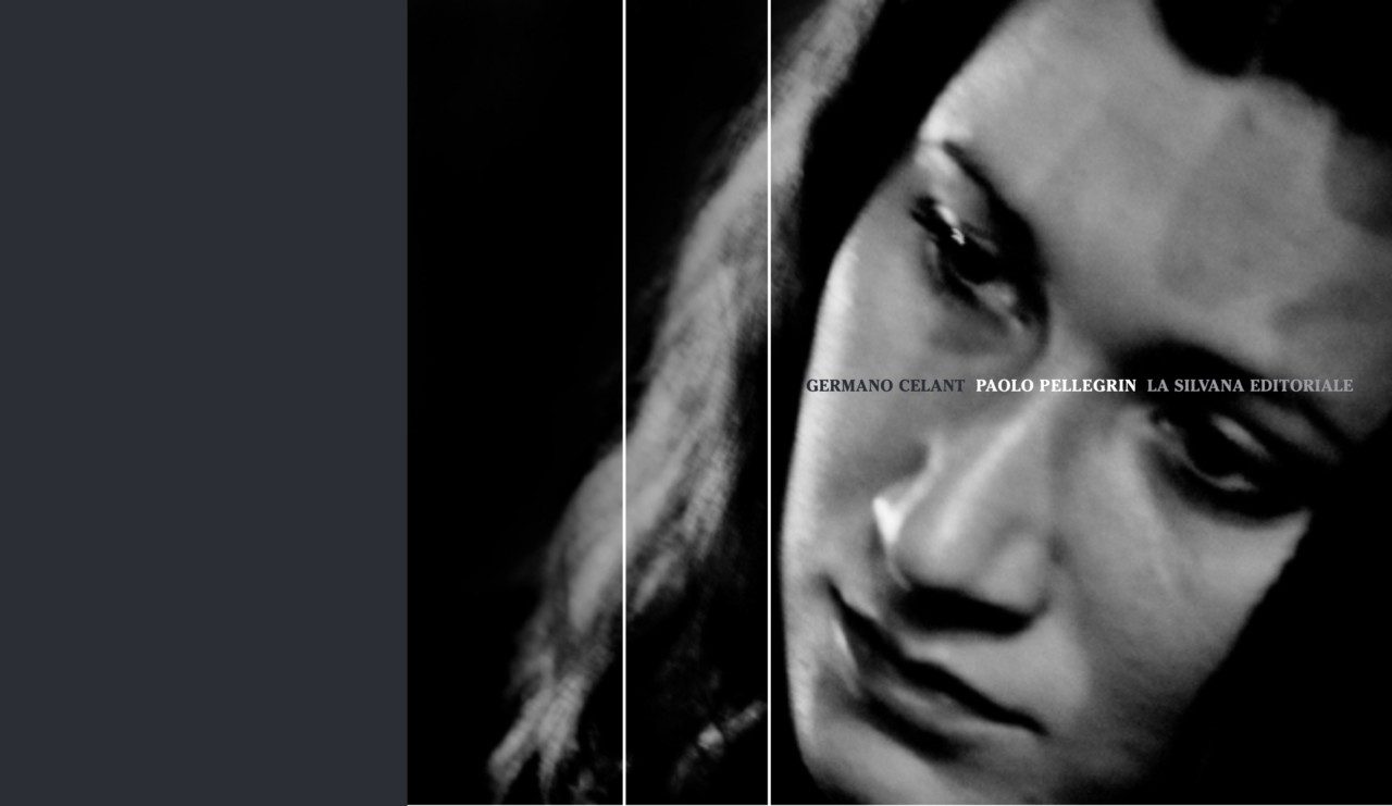
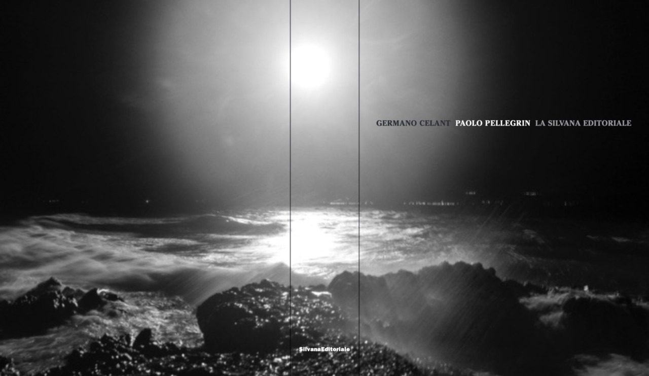
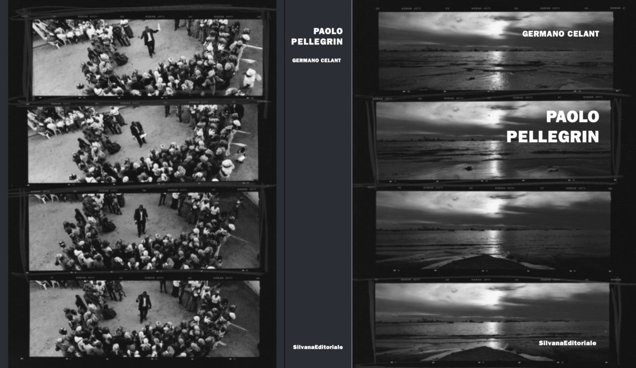
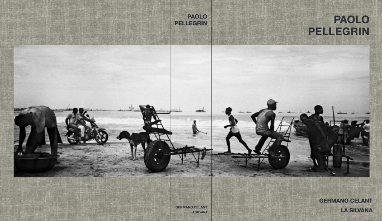
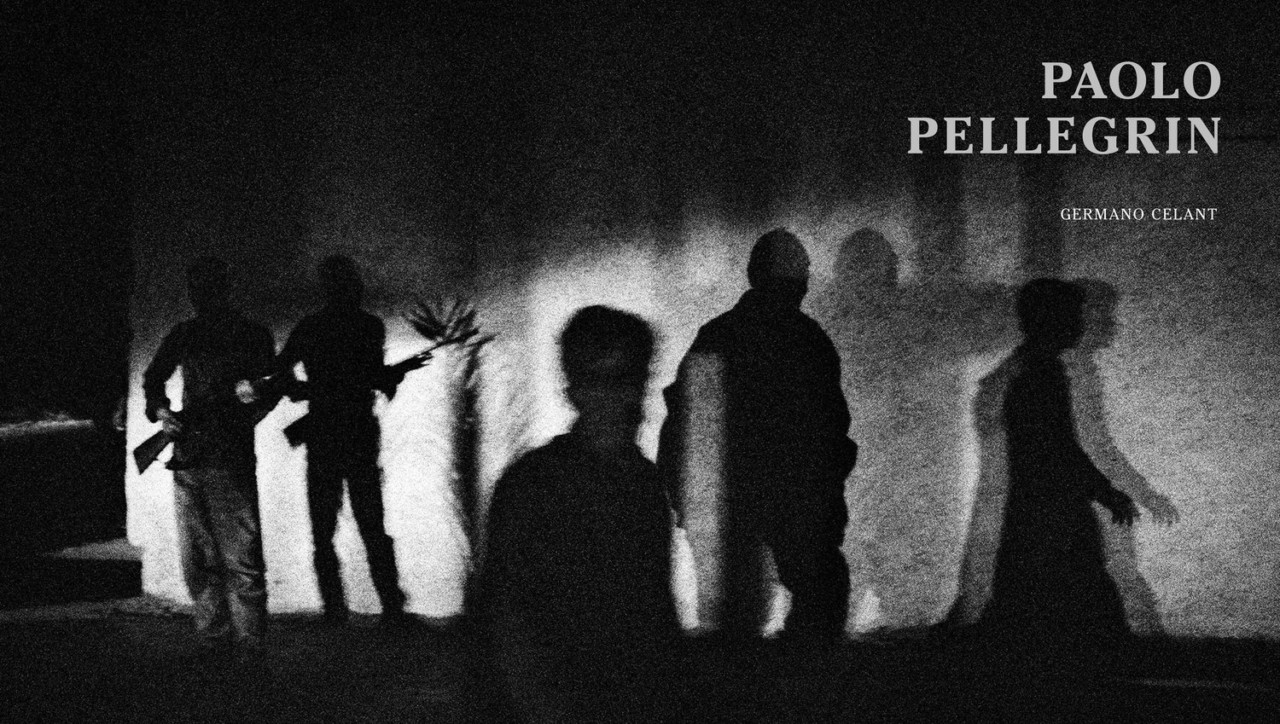
Below you can see a slideshow of 24 cover options created by Cuomo and her team, followed by the final cover design.


